Designing Extensible Components with TypeScript
Flexible React component design using generics and type inference

Recently, our team at Lubycon started a small project called lubycon-ui-kit together with mentees from a mentoring program. It’s still in its early stages with not much to show, but the goal is to build a UI library based on Korean typography that’s easy for domestic designers and developers to use.
Like many modern projects, this one was built by mixing React and TypeScript in the right proportions, sprinkling in a generous helping of Storybook, and finishing it off with Rollup.
Once a component is designed, the developers and designers get together for a review. If it passes, we immediately start development, deploy Storybook to a dev server, and do a final review — a short iteration cycle. I want to share some of the struggles I had while typing the component interfaces for this UI kit.
It All Comes Down to Abstraction…
I personally believe the hardest part of building an open-source library project is the design. This includes module and component interfaces, encapsulation decisions about what to expose and what to hide from users, and more.
On top of that, since this kind of project involves collaboration from the start rather than solo work, the team needs to align on design values.
Honestly, I didn’t think too deeply about the design going in, because I was already using TDS (Toss Design System) for service development at work. I vaguely thought, “Can’t I just build something with a similar feel?”
 This design system alone speeds up development tremendously
So in our first sync meeting with the designers, I was excitedly explaining things using TDS as an example, when I got this response:
Um… a design system and a UI kit are slightly different concepts.
Here’s what that means: a design system is a concept infused with an organization’s brand and design philosophy. So TDS, which I use at work, embodies the various design philosophies that Toss as an organization stands for — meaning it might not translate directly to other organizations.
A UI kit, on the other hand, is as decoupled from such philosophies as possible, providing pure UI components.
In other words, something like Bootstrap doesn’t carry a specific design philosophy — it’s a collection of UI components you can assemble like LEGO blocks, making it a UI kit. When an organization like Google creates Material Design, Airbnb creates its Design Language System, or Toss creates TDS, they’re embedding design philosophy into a UI kit to create a design system. (UI kit is said to be the broader concept that encompasses design systems.)
Since I was so accustomed to TDS’s interfaces from daily use at work, I’d vaguely assumed “I’ll just build something with a similar feel.” But after hearing this, I revisited the design systems mentioned above and realized how deeply each organization’s design philosophy is embedded in them.
Ultimately, a UI kit needs to guarantee enough flexibility for users to customize it to fit their organization’s design guidelines and coding conventions, which means abstraction requires even deeper thought than when building a design system.
Building Components That Guarantee User Freedom
After this conversation, the first thing the frontend developers discussed was: “How much freedom should we guarantee users?”
For example, imagine building a clickable component like Button. In HTML, there’s more than one way to express that an element is clickable:
<button>I'm a button</button>

<input type="button">Me too</input>

<a>Not a button but can be used like one</a>

<div role="button">Technically I'm a button too</div>
Of course, using role="button" like the last example requires the developer to separately add tabindex for focusability, define click or keydown event handlers so the button activates on Enter or Space when focused — otherwise it wouldn’t be considered a semantic button. That might seem odd, but the important point is that none of these are errors.
A design system bound to a specific organization’s philosophy can simply create a rule like “the Button component must always render as a button element” — as long as that design philosophy is shared within the team, it’s fine. But a UI kit should help with UI concerns while preserving the way users originally work with HTML, making this kind of consideration essential.
After much deliberation, we decided to preserve HTML’s original usage as much as possible. And somehow, I ended up being the one to design the first component for this project.
Let’s Build a Text Component
The component I was assigned was the Text component. When defining a UI kit, the designers said we needed to define typography and color palette first as the system’s foundation, so naturally the component that expresses typography came first.
Of course, the typography style data itself is also provided as SCSS, CSS variables, and JS modules, but having to import modules or write classes every time you use typography is quite tedious — so providing a component is cleaner.
// Something like this
<Text typography="h1">I'm heading 1</Text>
<Text typography="content">I'm content</Text>
And since you can use various elements like span, p, div to render text in HTML, the Text component should also have an abstract interface that allows rendering as different elements.
In other words, the Text component should only concern itself with typography, and everything else should work exactly as if you were using a native p or span element.
Designing Through Incremental Abstraction
As mentioned, to guarantee user freedom we must not break the behavior of HTML elements within React. So the component’s properties should faithfully reproduce the attributes of the target element.
Users should also be able to render whatever element they want — span, p, div, etc. We could force users to only use span or p, but enforcing such rules goes beyond the concern of typography.
Since we’re developing with TypeScript, and this library needs to provide types via *.d.ts files, the component’s property types should flexibly change based on the element the user wants to render, enabling proper IDE autocomplete and static type analysis.
In this post, I’ll walk through my abstraction process in three stages: mimicking HTML elements, adding custom properties, and allowing rendering as any element.
Mimicking HTML Elements
The first design step is to mimic HTML elements directly. React provides an HTMLAttributes type for convenient access to element attribute types, so just this much lets you replicate an HTML element:
type Props = HTMLAttributes<'span'>;
const Text = (props: Props) => { /* ... */ }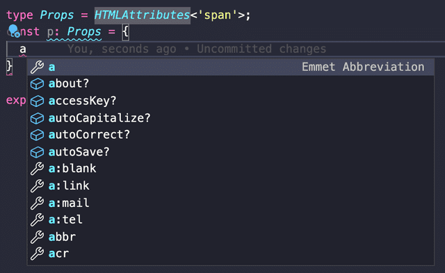 Even just this gives you nice autocomplete
But this type won’t work as-is. HTMLAttributes only contains React’s basic HTML attributes — it doesn’t include ref or key.
You could use React’s DetailedHTMLProps type to include ref in the properties, but that only declares the type — it doesn’t actually make the component pass ref through. It’s purely a type declaration.
This is well documented in React’s official docs under Forwarding Refs:
refs will not get passed through. That’s because ref is not a prop. Like key, it’s handled differently by React.
Forwarding Refs - reactjs.org
To truly replicate how HTML elements work in React, you need to implement the ability to receive ref from a parent component and pass it to a child — and that’s what the forwardRef function is for.
const Text = forwardRef(function Text(
  props: ComponentPropsWithoutRef<'span'>,
  ref: Ref<HTMLSpanElement>
) {
  return <span ref={ref}>{props.children}</span>
});
The forwardRef function passes props and ref to its callback. Since the forwarded ref comes as a separate argument, props naturally excludes ref.
Conveniently, React provides the ComponentPropsWithoutRef type that types all component properties minus ref, so developers don’t need to manually use the Omit utility type to remove the ref key.
Adding Custom Properties
At this point, the Text component has the same functionality as a span element. This pattern of using forwardRef to pass everything from a parent to a child is a common technique also used when creating Higher-Order Components (HOCs). (In fact, that’s where it’s used more often.)
But the Text component needs to accept not just span element attributes, but also custom typography-related properties from our UI kit. As it stands, it’s just a plain span. So we need to add custom property types to the span element attribute types.
Since TypeScript provides intersection (&) types, this seems straightforward:
type TextProps = {
  typography?: string;
} & ComponentPropsWithoutRef<'span'>;

const Text = forwardRef(function Text(
  { typography, ...props}: Props,
  ref: Ref<HTMLSpanElement>
) {
  //...
})
Intersection types merge two different types, so this bundles my typography property with span element attributes into the TextProps type.
But there’s a problem with this approach: it can’t handle cases where a custom property has the same key as a property from ComponentPropsWithoutRef<'span'>.
Let me illustrate with an example. If I add a customId property to my custom props, it infers correctly as declared:
type TextProps = {
customId?: number;
} & ComponentPropsWithoutRef<'span'>;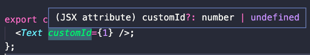 Inference works perfectly — satisfying
But if I add id — which already exists inside ComponentPropsWithoutRef<'span'> — the two intersected types collide, and my declared id property gets unexpectedly inferred as undefined:
type TextProps = {
id?: number;
} & ComponentPropsWithoutRef<'span'>;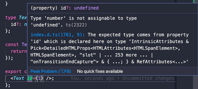 The confused compiler
The compiler gets confused because intersection types in TypeScript aren’t inheritance with overriding. From the compiler’s perspective, it can’t determine which id is correct — the one from custom properties or the one inside ComponentPropsWithoutRef<'span'>.
type A = { id?: number };
type B = { id?: string };

// Both have id...
// Which one is correct?
type Result = A & B;
This issue also occurs with interfaces using extends for inheritance. Trying to override a property that exists on the parent produces an “Interface ’*’ incorrectly extends…” compile error.
When we merge objects using JavaScript’s Object.assign, if both the first and second objects have the same property, the first object’s property is implicitly overridden by the second:
Object.assign({ foo: 1 }, { foo: 2 });// Implicitly overridden by the second object's property
{ foo: 2 }But TypeScript is a statically typed language that favors explicit declarations, so it never allows such implicit overriding.
To merge types this way, you first need to use the Omit utility type to remove the properties you want to override, then merge. But doing this every time with Omit is tedious, so it’s better to create a merge utility type:
type Combine<T, K> = T & Omit<K, keyof T>;Combine takes two generic types, removes all properties from K that overlap with T, then merges them with an intersection. In effect, if a key declared in T also exists in K, T’s version wins.
Now we use Combine to merge our custom properties with span element attributes to declare the final Text component properties.
Even if a developer’s custom property happens to overlap with a span attribute, Combine handles the override automatically, so developers can declare properties as usual without extra concern:
type TextProps = Combine<{ id?: number; }, ComponentPropsWithoutRef<'span'>>;Making It Renderable as Any Element
The Text component now flexibly includes both custom properties and HTML element attributes, but there’s one more layer of abstraction left.
So far, the Text component can only render as a span. But as we’ve discussed repeatedly, there’s no law saying you must use span for text content in HTML, so we need to abstract one more level to allow the render target element to be freely changed.
<Text as="p" /> // Renders as p, typed with p element attributes
<Text as="a" href="..." target="..." /> // Renders as a, typed with a element attributes
The common approach is providing an as prop that accepts an element tag name and renders accordingly. I went with the same approach. (Basically copied Bootstrap.)
In previous abstractions, the render target was guaranteed to be span, so we just needed to merge types correctly. Now that the target could be anything, we need to accept it flexibly via a generic type.
Let’s look at the Text component’s property type again:
type TextProps = Combine<{ id?: number; }, ComponentPropsWithoutRef<'span'>>;I want this type to accept not just span but various elements, so I need to turn the 'span' in ComponentPropsWithoutRef<'span'> into a type variable like ComponentPropsWithoutRef<T>.
In other words, once we receive an HTML element name via the as prop, we find the matching element attribute type and merge it into the Text component’s properties using Combine.
Breaking Down Generics and Type Inference
Let’s think about how to type this according to the design. It’s best to start from the outermost layer — the Text component’s properties that receive the generic type T directly from the user:
// Text component's custom properties
type TextBaseProps<T> = {
  typography?: string;
  as?: T;
}

// Props<T> passes T directly to ComponentPropsWithoutRef<T>.
// It also binds T to the as property inside custom props.
type TextProps<T> =
  Combine<TextBaseProps<T>, ComponentPropsWithoutRef<T>>;
.
.
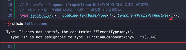 Wrong answer!
In my optimistic mental model this seemed fine — why does it fail? After all, everything uses the same type variable T and just passes it along.
The reason is that ComponentPropsWithoutRef restricts its generic to ElementType. Since my type places no constraints on the type variable T, passing it directly to ComponentPropsWithoutRef causes a compiler error.
So if we want to safely pass type variable T to ComponentPropsWithoutRef, we need to constrain it to ElementType from the very point where the Text function receives its generic:
type TextBaseProps<T extends ElementType> = {
  typography?: string;
  as?: T;
}

type TextProps<T extends ElementType> =
  Combine<TextBaseProps<T>, ComponentPropsWithoutRef<T>>;
function Text<T extends ElementType>(props: TextProps<T>) {}Seeing that the Text component takes a generic type, you might think you’d need awkward syntax like <Text<'span'> /> — but that’s not the case.
That’s because this generic type T can be inferred. Looking at the example above, the type variable T that Text receives flows through TextProps<T> to TextBaseProps<T> and gets bound directly to as.
All these type variables are guaranteed to be the same:
TinText<T>TinTextProps<T>TinTextBaseProps<T>Tbound to theaspropertyTinComponentPropsWithoutRef<T>
This means that if just one of these points makes the type of T clear, the rest can be inferred naturally.
Using TypeScript’s type inference, if we assign 'span' as the default for T, or if a value like 'span' is passed to the as prop, the remaining Ts are automatically filled in with the same type:
function Text<T extends ElementType = 'span'>(props: Props<T>) {}

<Text /> // -> T is inferred as span
<Text as="p" /> // -> T is inferred as p
Now that we understand the type inference flow, let’s type this properly.
Abstracting the as Prop Typing
The as prop pattern — rendering as any desired element — isn’t unique to Text. Components with abstract concerns like a Grid layout component would all need this capability.
But if every developer had to manually add as to their props and think through generic inference relationships each time, it would be quite painful.
So we need to abstract this part as much as possible so that other components can easily add the as prop. Something like this:
// Text component properties
type TextBaseProps = {
  typography?: string;
}

// OverridableProps automatically includes the as prop for type inference
// and types HTML element attributes based on T!
type TextProps<T extends ElementType> = OverridableProps<T, TextBaseProps>;
OverridableProps abstracts only the part where a component receives an HTML element name via as and internally finds and binds the corresponding element attribute types.
With this abstraction, other developers don’t need to think about using ComponentPropsWithoutRef, constraining T to ElementType in Combine, or other tedious details — they can just add the as prop quickly and easily. (…he said, optimistically.)
Now let’s refine what we built earlier to create OverridableProps.
The Combine<T, K> utility type we created earlier has no constraints on its generics, but ComponentPropsWithoutRef<T> — representing the HTML element attributes we need to merge — restricts its generic to ElementType.
So first, we need to bridge this gap:
type CombineElementProps<T extends ElementType, K = unknown> = Combine<
  K,
  ComponentPropsWithoutRef<T>
>;
// Hide the existence of ComponentPropsWithoutRef
type TextProps<T extends ElementType = 'span'> =
CombineElementProps<T, TextBaseProps>;CombineElementProps constrains one of the two types being merged to represent an HTML element, then passes it directly to ComponentPropsWithoutRef, preventing type mismatch errors.
By defaulting the K type variable to unknown, we ensure that users of this utility type must provide the component’s properties for K.
For the same reason, TextProps — which passes generics to CombineElementProps — must also constrain its type to ElementType. Then we use CombineElementProps to define OverridableProps, which adds the as prop:
type OverridableProps<T extends ElementType, K = unknown> = {
  as?: T;
} & CombineElementProps<T, K>;

// The as prop with generic type inference is now included.
type TextProps<T extends ElementType> = OverridableProps<T, TextBaseProps>;
Now with OverridableProps, you just pass the desired ElementType and your component’s custom properties to conveniently create a type with the as prop.
Full Code at a Glance
Since it’s hard to follow the full picture when code and explanations alternate, here’s the complete code in one place:
export type Combine<T, K> = T & Omit<K, keyof T>;

export type CombineElementProps<T extends ElementType, K = unknown> = Combine<
  K,
  ComponentPropsWithoutRef<T>
>;

type OverridableProps<T extends ElementType, K = unknown> = {
  as?: T;
} & CombineElementProps<T, K>;
type TextBaseProps = {
typography?: string;
}
type TextProps<T extends ElementType> = OverridableProps<T, TextBaseProps>;function Text<T extends ElementType = 'span'>(
{ typography = 'content', as, ...props }: TextProps<T>,
ref: Ref<any>
) {
const target = as ?? 'span';
const Component = target;
return (
<Component
ref={ref}
// Typography class rendering logic here
{...props}
/>
);
};
export default forwardRef(Text) as typeof Text;Closing Thoughts
When I was first “chosen” to develop the Text component, I honestly didn’t take it too seriously. It’s just one component without any grand functionality — I figured it’d be quick. Turns out the typing was tougher than expected.
I use TypeScript in both my day job and personal projects, but I rarely have to write deeply nested generic types with layered inference like this. Usually I’d just ask Google, somehow solve it, and forget about it.
One thing I learned through this struggle is that @types/react isn’t actually that hard to read. It’s worth browsing through when you have some time.
The ComponentPropsWithoutRef type I used heavily has an internal chain of 4-5 type references. Just tracing through those referenced types reveals plenty of useful types for everyday work:
ComponentPropsWithoutRef<T>>PropsWithoutRef<T>>ComponentProps<T>>JSX.IntrinsicElements[T]> …(and a few more)
The file is around 3,000 lines, which might feel daunting, but if you follow the type reference chain like I did, you’ll find the number of core types isn’t actually that large. Plus, types like IntrinsicElements — which hold HTML element names as keys — take up a significant chunk of those lines.
 Honestly, compared to typesafe-actions, React's type readability is quite generous.
That place is pure chaos...
That wraps up this post on designing extensible components with TypeScript.
관련 포스팅 보러가기
Beyond Functors, All the Way to Monads
ProgrammingWhy Do Type Systems Behave Like Proofs?
Programming[All About tsconfig] Compiler options / Emit
Programming/Tutorial/JavaScript[Everything About tsconfig] Compiler Options / Modules
Programming/Tutorial/JavaScript[Everything About tsconfig] Compiler Options / Type Checking
Programming/Tutorial/JavaScript